A pixel art character can look simple, but every pixel in it is a decision. On a small canvas there is no room for extra lines, so the whole image depends on a few clear choices: size, colours, outline and shading. This guide goes through those choices in order, so you can make your first small sprite without getting lost in detail. The step-by-step images below all use one 32×32 character drawn for this guide.
1. Start with a small canvas
The most common beginner mistake is starting too big. A 128×128 canvas feels comfortable, but it quickly turns into a regular drawing done with a very hard brush. Small sizes force you to simplify, and that is where the pixel look comes from.
- 16×16: very limited, close to early handheld and 8-bit games. Good for icons and tiny characters.
- 32×32: the most practical size for a first character. There is room for eyes, hair and clothing, but not for small details.
- 64×64: closer to 16-bit console graphics. Allows facial expressions and more shading, but takes much longer.
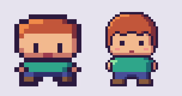
Work at the small size and zoom in while you draw. When you want to share the image, scale it up by a whole number (4×, 8×, 10×) using “nearest neighbour” scaling, so the pixels stay sharp instead of turning blurry.
2. Choose a limited palette
Pixel art usually works with far fewer colours than a normal illustration. A first character can be done with 8 to 16 colours in total. Fewer colours make the image look consistent and are easier to manage.
For each main area (skin, hair, clothing) pick three tones: a base colour, a darker shadow and a lighter highlight. A useful habit is to shift the hue slightly as well as the brightness. Shadows lean a little towards blue or purple, highlights a little towards yellow. This “hue shifting” keeps colours from looking flat or muddy.

3. Block out the silhouette first
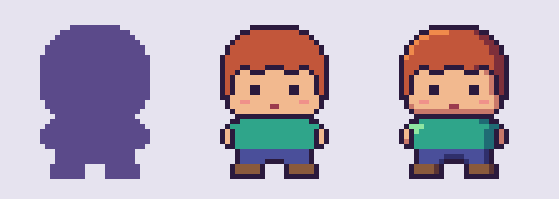
Before any detail, fill the character’s shape with a single colour. If the pose and proportions read clearly as a flat shape, the finished sprite will read clearly too. If the silhouette is confusing, no amount of shading will fix it.
Small characters often use exaggerated proportions. A head that takes up a third or even half of the body height leaves room for a readable face. Hands and feet can be just one or two pixels.
4. Clean up the outline
Once the shape works, add an outline. Two things matter most:
- Avoid “jaggies”. Curves should step in regular patterns: 3-2-1 pixels, or 2-2-1-1, rather than random jumps. Irregular steps make a line look shaky.
- Remove doubles. Where a line has two pixels touching side by side and diagonally at once, delete one of them. A clean outline is one pixel wide.
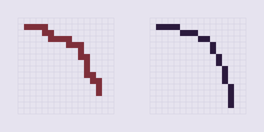
The outline does not have to be black. A dark version of the colour next to it often looks softer and more finished. Some styles drop the outline inside the character and keep it only on the outer edge.
5. Add simple shading
Decide where the light comes from, usually the top left or top right, and keep it the same everywhere on the character. Then add the shadow tone on the opposite side of each shape and a few highlight pixels where the light hits most directly: the top of the hair, the forehead, the shoulder.
Keep shading in large, clear areas. Single scattered pixels of different colours make the image look noisy. Dithering (a checkerboard of two colours to suggest a third) can work for larger surfaces, but on a 32×32 character it is usually better to leave it out.
6. Faces at small sizes
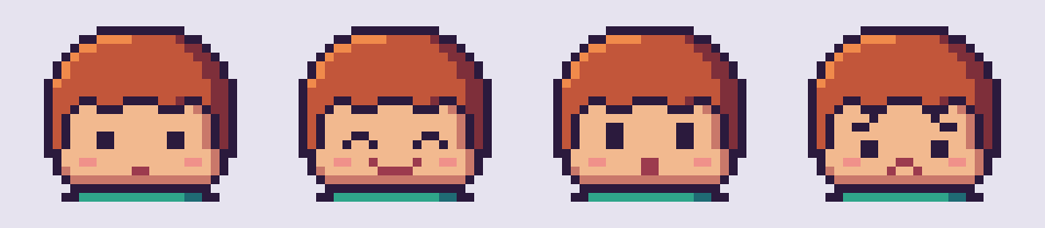
At 32×32 a face has very little space. Eyes can be a single dark pixel or a 1×2 block. A one-pixel change in the mouth, or moving the eyebrows by one pixel, changes the whole expression. Try a few versions side by side; it is the fastest way to see what works at that size.
7. Tools you can use
You do not need expensive software to start. Aseprite is a popular paid editor made for pixel art and animation. Free options include LibreSprite, Piskel (in the browser) and Pixelorama. On a tablet, Procreate can work if you set a small canvas and turn off brush smoothing and antialiasing.
If you want to see how small characters are put together before drawing your own, a parts-based builder helps. The Pixel Character Maker on Toonizer lets you combine ready-drawn hair, faces and clothing, so you can study how each part is built pixel by pixel.
Common mistakes to avoid
- Starting with a large canvas and ending up with a blurry, overworked image.
- Using too many similar colours that blend into each other.
- Shading with soft brush strokes or gradients instead of clear tone steps.
- Resizing the finished image with smooth scaling, which blurs the pixels.
- Adding detail before the silhouette reads well.
Where to go next
After your first character, try drawing the same one in two or three poses. That is the first step towards animation, and it shows quickly which parts of your design are too complicated.
You can also put small pixel characters to use. The Pixel Mood Calendar keeps a daily mood journal with tiny pixel faces, and for the holidays the Pixel Christmas Card Maker lets you put together a card in the same retro style.
0 Comments